(Co-written & insights from our Head of Web Design James Walsh).
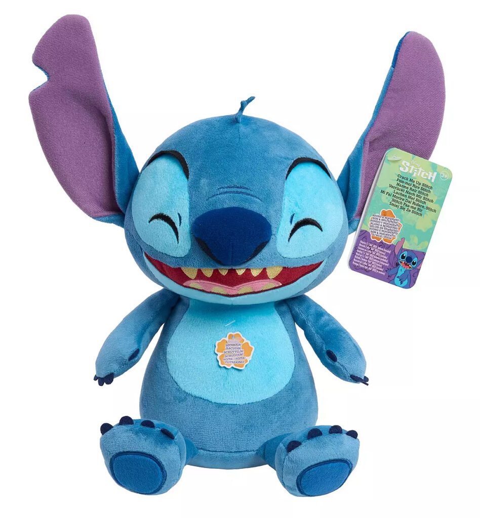
This time of year inevitably brings a frenzy of last-minute shopping, with stressed-out parents scrambling for the latest "must-have" toys. This year, the hot-ticket item? The Disney Crack Me Up Stitch Plush. You can almost picture the epic dad scuffles in toyshops across the country on Christmas Eve – it’s like Jingle All The Way come to life.
But while chaos reigns in toy shops, how are online retailers optimising their experiences to handle the demand? How are their product pages designed to convert browsers into buyers, and are they maximising every opportunity?
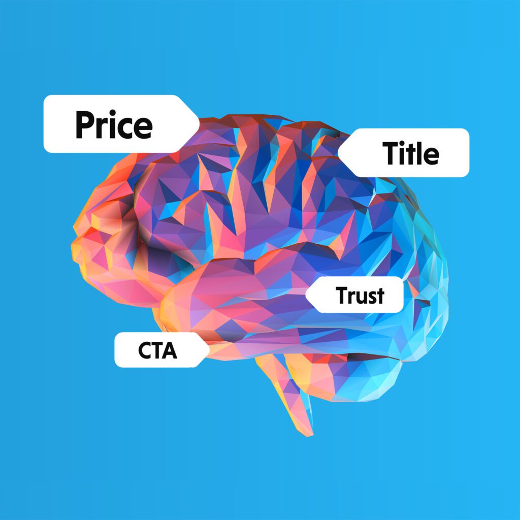
First up, some psychology... 🧠
When users land on a page, they don’t consciously process every element right away. Instead, their brains subconsciously register only a few select elements – this is known as pre-attentive processing. Elements like colour, size, and position are processed quickly, without the user being aware of it.
Big eCommerce sites know this. This is why they design their product pages with these subconscious cues in mind. From colours to buttons, to the size of images or text, how these crucial elements are perceived can make or break a shopping experience.
Now, we're a curious bunch at The Digital Maze, so we decided to analyse how the top UK eCommerce sites are laying out their product pages to maximise conversions this Christmas.
Using AI-powered heatmapping tools, alongside expert insights from our design team, we conducted a deep dive into the top 10 search results for this year’s must-have plush toy.
The goal? To uncover what’s working, what isn’t, and how effectively these sites are capturing user attention. Will we learn anything? Let's find out...
Before we jump in, there are some caveats.
AI analysis is incredibly useful, but it’s not always 100% accurate. We used Clueify to help us in our research, which claims to be 92% accurate so we’re reasonably confident.
Similarly, some of the analysis here is subjective, though it is based on our (ahem, expert) observations and extensive experience. We're not going to pretend its an extensive and intensively thorough exercise.
The equipment we used for the analysis could produce slightly different results compared to other tools or methods, so this is just one perspective. We’ve focused on the top 10 search results from December 2024, which may not necessarily reflect actual sales or long-term trends.
And finally, while our main focus was on the above-the-fold content to see what grabs attention first, we also studied full-page analysis to get a more complete picture.
So, with that in mind, let’s see what we found! (And if you want to just skip to the conclusion, that’s cool too!)
Our Top 10 eCommerce Results for Disney Crack Me Up Stitch Plush™ (Google, UK)
Your experience may vary, but we found that the top search results for this toy were:
Abgee
Amazon
Argos
BM Stores
The Entertainer
Hamleys
Home Bargains
Littlewoods
Selfridges
Very
Product Page Analysis
Let's take a deeper dive into each of our site's product pages.
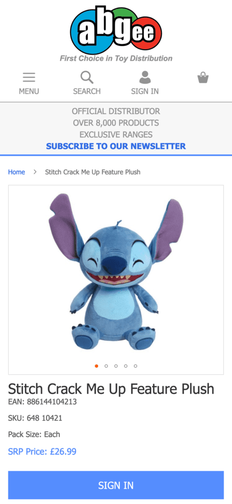
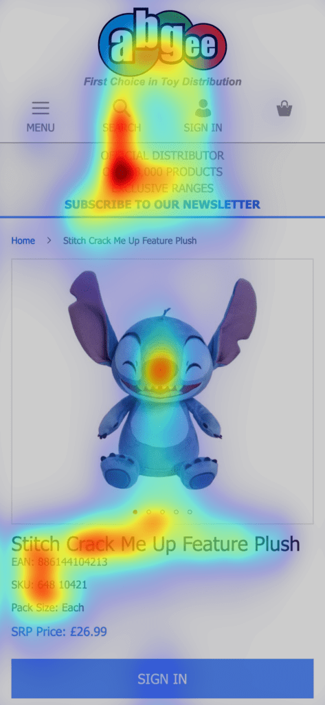
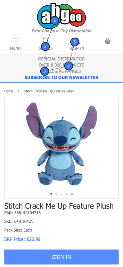
When we took a closer look at Abgee, we noticed that their USP (Unique Selling Points) bar grabs quite a bit of attention. It’s working hard to build trust, which is great for reassuring potential buyers, especially as I’ve never even heard of the site (sorry Abgee!).
However, there’s one thing that might be causing a tiny bit of hesitation: the Sign In CTA. Instead of a straightforward "Buy Now" button, asking users to sign in first can be a bit of a mental blocker – I just want to buy this thing, sign me up later!
That said, it’s not all bad news. Abgee still managed to land in the top 3 for clarity in our analysis, which suggests they’re doing a great job at presenting the product in a clean, easy-to-navigate way.
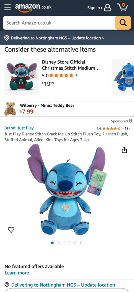
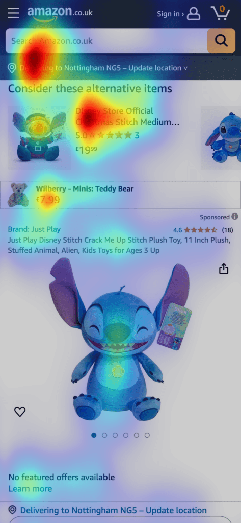
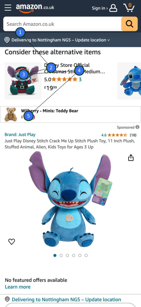
When we looked at Amazon, we noticed something pretty interesting: they’re showcase other products before the main one. Is that strange?
These upsell and cross-sell items are given prime real estate on the page: 36% of user attention was directed towards them, compared to just 16% for the Stitch toy image itself.
It’s likely that Amazon is using its vast data and AI capacity to maximise sales opportunities, nudging shoppers towards related products based on their behaviour. The idea is simple: don’t leave just yet – in fact NEVER leave... look at all the other great stuff we have! (No wonder Google is terrified of them).
However, despite their powerful sales engine, Amazon falls behind in terms of usability. It scored in the bottom 3 of our 10 sites for clarity, which is a little surprising given how slick their platform is. What's also interesting is that there’s no price or “Buy Now” button above the fold, making it a little harder for users to quickly decide to purchase. Though in this day and age, we know users aren't afraid to scroll.
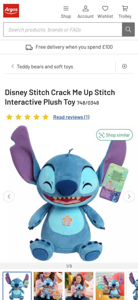
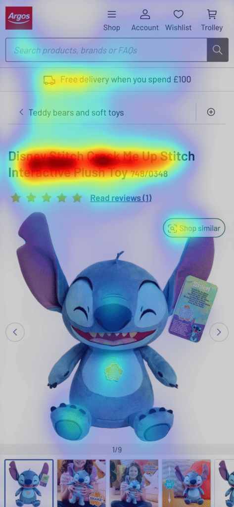
Looking at Argos, we noticed they put a lot of emphasis on the product name, which is front and centre, and the AI software picked up on this too.
While this is good for clarity, it does mean that some other important details, like the pricing and “Buy Now” button, get pushed further down the page.
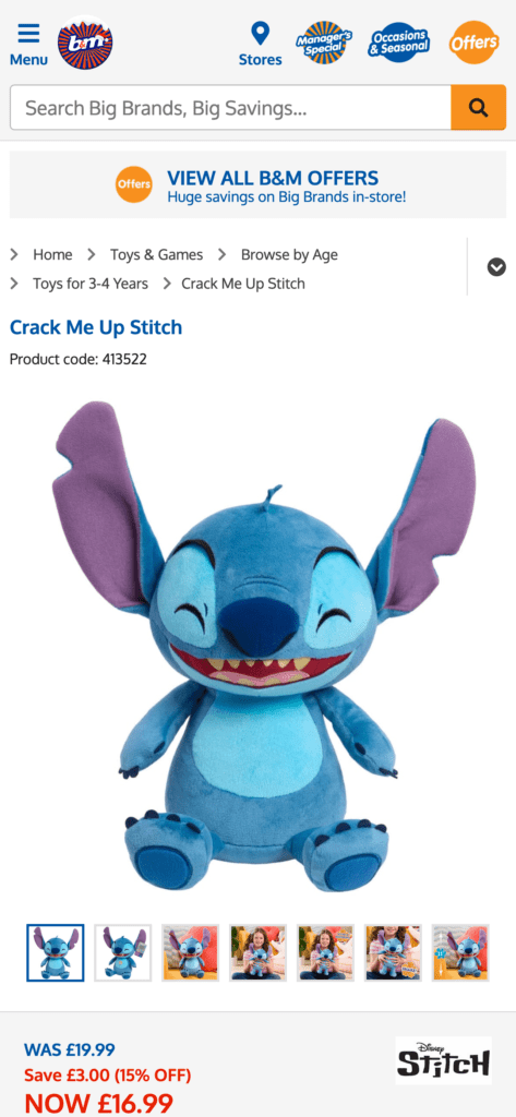
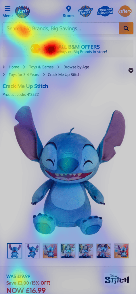
So, B&M is the only site in our analysis that isn’t an eCommerce store – that's my mistake, I didn't notice until the analysis stage.
While they do have an online presence, it’s more focused on providing product information rather than facilitating direct purchases.
That said, we noticed that search and USP elements dominate the page, whereas the pricing is fairly small, key factors in determining whether or not users pop down to a physical store.
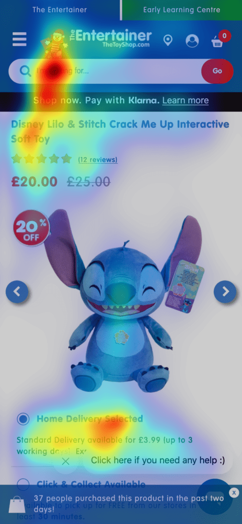
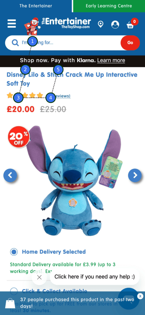
When we took a look at The Entertainer’s online shop, I have to admit, I was surprised by how it scored. Personally, out of all the stores we analysed, I felt it captured the vibe of toy shopping best – it has that fun, playful energy you'd expect from a dedicated toy retailer. But, despite that, it scored the worst for clarity in our analysis. So what do I know, eh?
The pricing, product title, search bar, and delivery details are all clearly visible, but some elements seem to get in the way. Again, there's no “Buy Now” button above the fold, plus, the site does get a tad annoying with its pop-ups.
It’s a bit of a shame because, in terms of atmosphere, this is one of the sites that really nails the old school toy-shopping vibe.
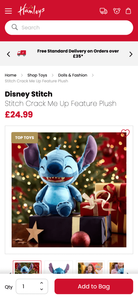
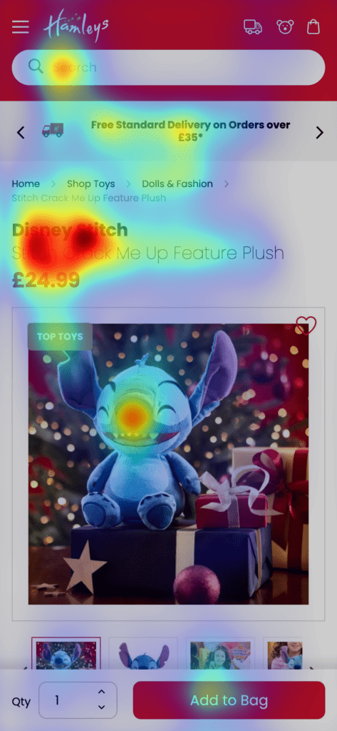
When we looked at Hamleys, we noticed something pretty unique – they're the only site in our analysis that uses their own staged product images (alongside the stock ones) which definitely adds a nice personal touch compared to the standard supplier shots.
The pricing and product title are also very clear, making it easy for shoppers to quickly understand what they’re looking at. However, despite these positives, Hamleys scored surprisingly low for clarity.
Like The Entertainer, it's a bit of a head-scratcher, considering their strong branding and the quality of their images. It seems like, while the design is visually appealing, some elements might be competing for attention or confusing the shopper a bit. Or AI is wrong? Yes, it's that.
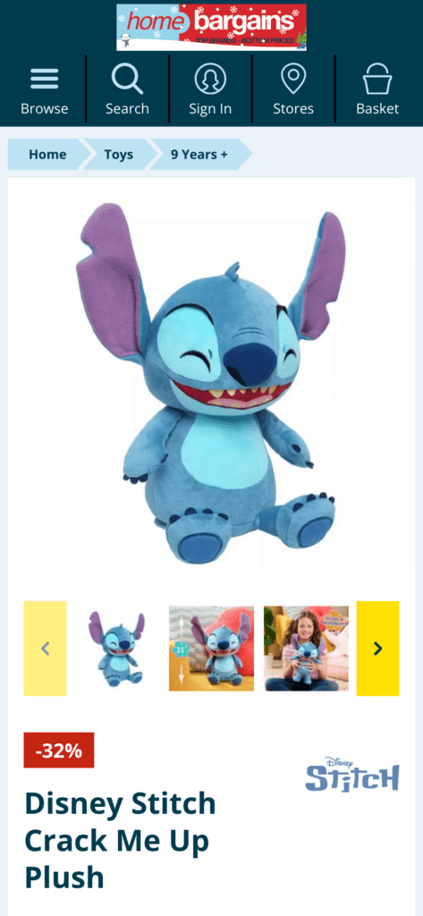
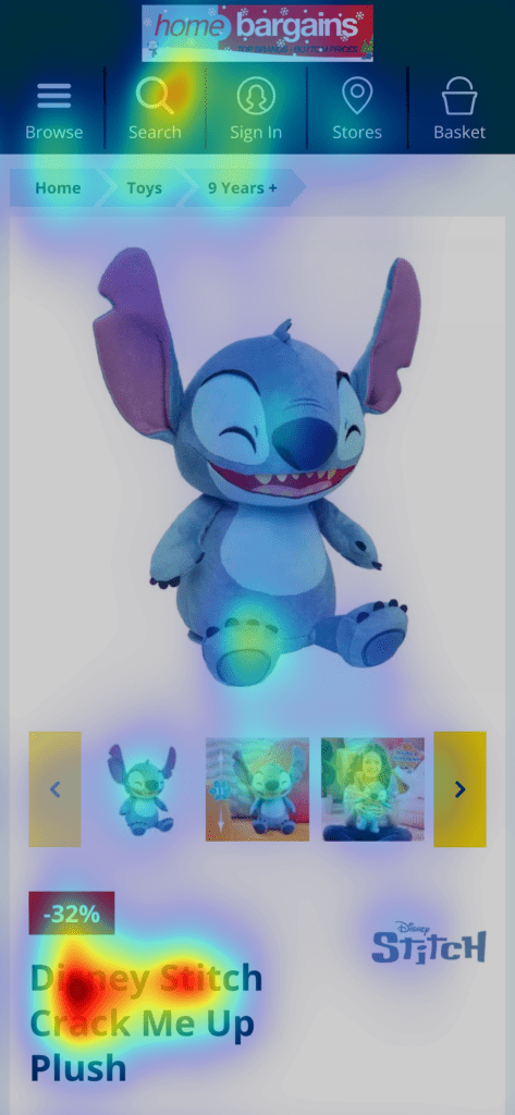
Home Bargains is basically a B&M carbon copy, but unlike B&M, they do have an eCommerce store. Digging into their site, I was impressed by how clear and easy to navigate it is – it even made it into the top 3 for clarity in our analysis.
However, there are a couple of things that could make the shopping experience smoother: there's no pricing above the fold, and the “Buy Now” button isn’t visible at the top of the page either.
Even though the overall design is clear, these missing elements might make it a little harder for potential buyers to act quickly – crucial as the days tick down to Christmas Eve!
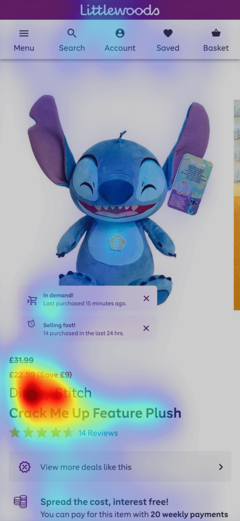
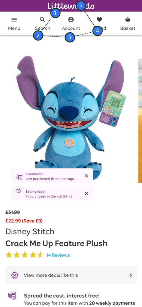
I actually though Littlewoods had ceased traded so I was a little surprised when it popped up. When we checked it out, we struggled to see the pricing, which was tiny and hard to find.
The page places a lot of focus on the product title, which is great for clarity, but it does leave less space for other important elements.
Again, there were a lot of featured pop-ups, like "hurry up, selling fast" that are meant to create a sense of urgency, but they’re a personal ick of mine!
In my opinion, their product pages (at least on mobile) need some work.
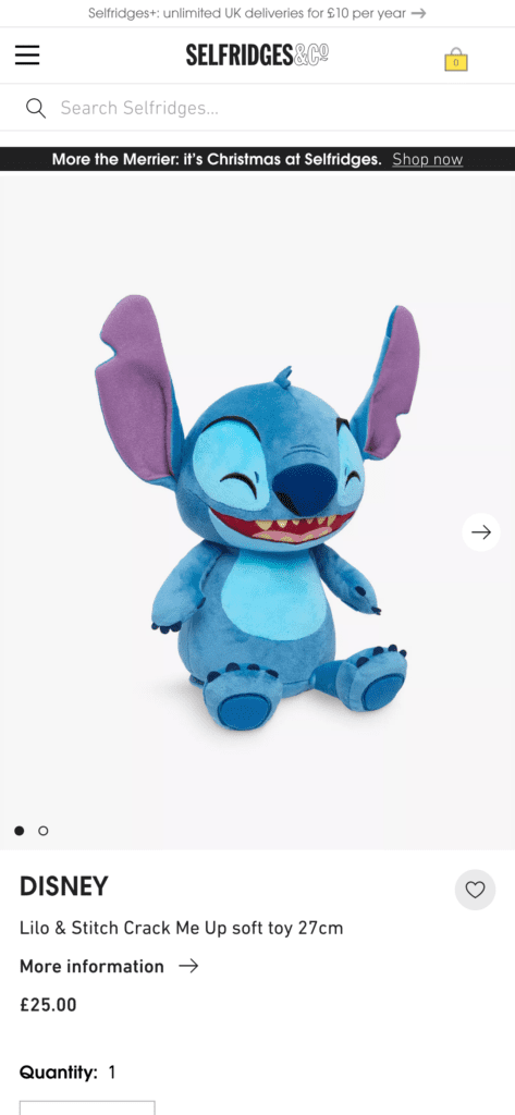
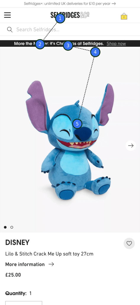
Selfridges is another site that suffers from tiny pricing details (what's that all about?). Again, the page focuses heavily on the product title, but it could benefit from more attention to other important elements.
One thing I noticed was that whilst their competitors display around 5-6 product images, Selfridges only has two in its gallery, which is definitely a missed opportunity.
That said, they did score in the top 3 for clarity, which shows they’re succeeding in making the product easy to find and understand (well, at least for AI).
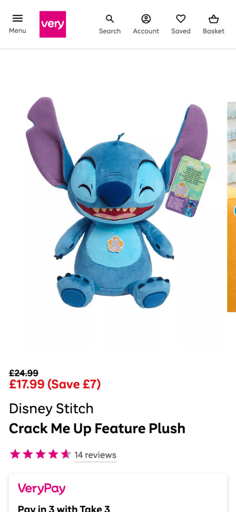
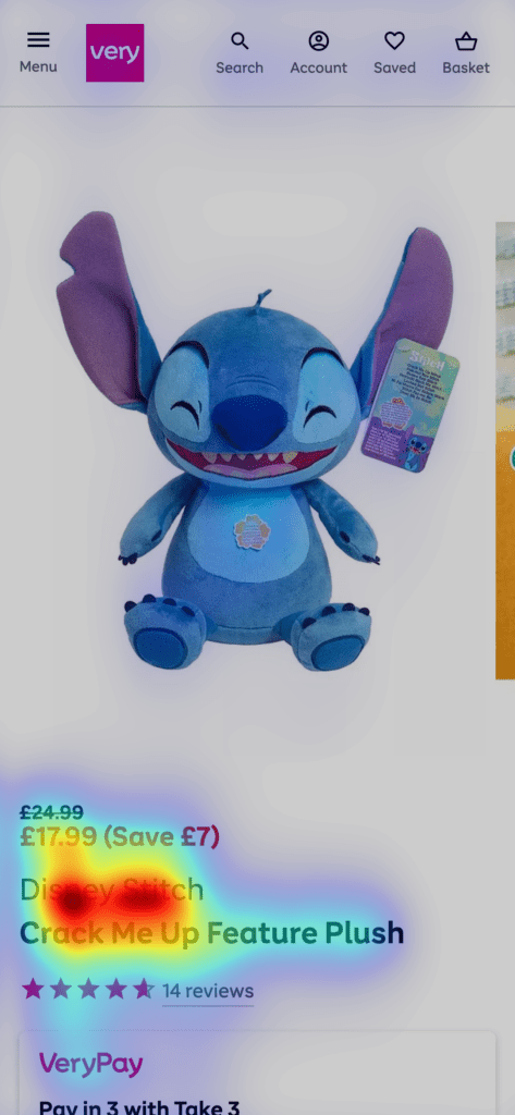
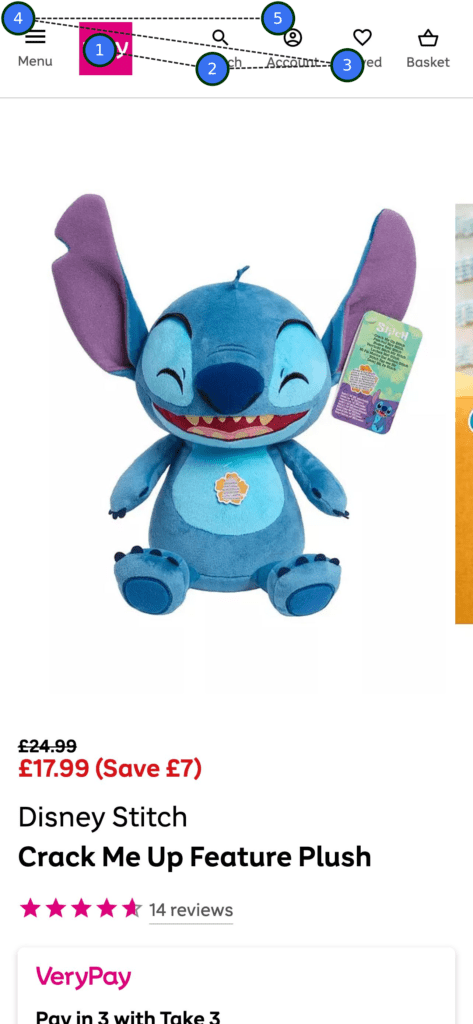
Our last site in the analysis was Very, and it’s definitely one of the less cluttered pages in our study, with clear pricing and product info – everything is easy to spot right away. Again, there’s no “Buy Now” CTA above the fold, but we’re so over that now. In fact, Very scores the highest in our clarity insight.
So What, if Anything, Did We Learn?
Clueify Clarity Scores and Above-the-Fold Performance
Clarity Insights reveal how effectively users can process information on a webpage. Scores ranged from an impressive 85% (Very.co.uk) to a lackluster 47% (The Entertainer).
Only Selfridges, Very, and Abgee performed well in terms of clarity, with Selfridges leading when we analysed the full page later.
On clarity scores - remember, it’s a balancing act. Decluttering is absolutely key - but visually simplify too much and you risk losing the long game of brand recognition. Try this for an example: hide the logo on Very and Selfridges with your finger and you could almost put any other brand’s logo in their place (At least Very have brand colours in their star ratings).
A safe space to experiment a little is in your neutral palettes to bring in just a hint of brand flavour to enhance memorability) Ideally - you win the sale. Even better if the customer remembers your site for next time.
James Walsh, Head of Web Design
Perhaps surprisingly, 9 out of 10 sites didn’t display a “Buy Now” call-to-action (CTA) above the fold. Also, pricing, a key motivator for online shoppers, was absent above the fold on 30% of the sites, including Amazon, Argos, and Home Bargains. These sites know we’re happy to scroll.
Visual Design and Attention Distribution
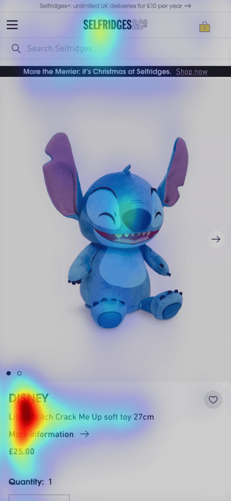
The main product image occupied an average of 39% of the screen, but it only garnered 21% of user attention. This moderate correlation (quick maths ≈ 0.47) suggests that other design elements, such as text, layout, and colors, play a larger role in drawing users’ eyes.
Hamleys was the only retailer to use unique, staged product photos alongside manufacturer images. Most others relied solely on standard shots.
Despite being a dominant player, Amazon’s UX scored poorly for clarity. Their use of upsells and cross-sells often diverts attention from the main product, with competing products attracting 36% of attention vs. 16% for the Stitch toy.
Website
Clarity Score (%)
Price Above Fold?
CTA Above Fold?
Product Image Size (% of Screen)
Product image Attention Score (%)
Very
85%
✅
❌
42%
20%
Selfridges
79%
✅
❌
40%
24%
Abgee
72%
✅
❌
33%
25%
Home Bargains
71%
❌
❌
39%
18%
Littlewoods
68%
✅
❌
42%
20%
Argos
67%
❌
❌
45%
27%
B&M
63%
✅
❌
45%
22%
Amazon
61%
❌
❌
30%
16%
Hamleys
48%
✅
❌
39%
26%
The Entertainer
47%
✅
✅
34%
15%
Average:
39%
21%
Amazon has the luxury of having trained their users since the 90’s in how to use their website and app. As such, they have a baked-in loyal audience that chooses them for convenience by default.
All this is to say that you should avoid the trap of looking at them as an example to imitate. You need to be providing the best experience you can to break users away from the amazon by default mentality. You probably aren’t going to beat them on price and delivery - so beat them on user experience!
James Walsh, Head of Web Design
Winners and Losers:
Selfridges & Very: These sites demonstrate that clarity in layout and prioritizing essential information above the fold (pricing, product title) can significantly enhance UX.
Amazon: Despite its data-driven dominance, Amazon ranks in the bottom three for clarity.
The Entertainer: As a dedicated toy retailer, it’s surprising to see The Entertainer scoring lowest in clarity. Perhaps a combo of pop-ups, an overwhelming layout, and no "Buy Now" CTA above the fold complicates the experience?
Key Takeaways for eCommerce Retailers
Do We Care About the Fold?
The often-repeated advice is to ensure that both pricing and a clear “Buy Now” button / CTA are visible above the fold. Failing to do so can create friction and hesitation for users who are ready to purchase. However, if users are naturally scrolling anyway, you could use that prime space for information that makes a bigger impact: images, titles, trust signals, etc.
Organised user testing can be an expensive and time consuming activity, you’re probably not running Amazon, and you certainly won’t have their budgets.
Thankfully, unless you are a very, very gifted ape - then you likely share the trait of being human with your users. Use this! If you’re really good at removing your own biases then ask yourself - how would you react to your webpages? If you’re not - then can your mum/sister/uncle/barry-down-the-pub use the page without any issue?
Stop people in the street or a coffeeshop if you need to - Guerilla UX testing is as valid a way to test your website as any other.
James Walsh, Head of Web Design
Keep it Clean
Building on the point above, avoid overcrowding any section of your product page with too much information. Give each element room to breathe and ensure it serves a clear purpose.
Pricing
Pricing is one thing I would definitely recommend placing above the fold, especially at this time of year. Shoppers are often hunting for the best deal, so having a prominent and competitive price can make all the difference. If customers can see the price straight away, you're more likely to grab their attention and stay in the running.
Avoid Distractions
Excessive pop-ups and competing calls to action can disrupt the shopping experience. Sites like The Entertainer had a lot of pop-ups that, while intended to create urgency, were also quite frustrating. Keep the focus on the product and key purchase actions to increase the chances of making a sale.
Know Your Shopper
Retailers like Amazon are constantly adapting by using data and AI to create personalised shopping experiences, including upsells and cross-sells. Consider implementing AI-driven recommendations based on user behaviour to increase opportunities for additional sales.
And Finally...
Perhaps my most important tip is this: If you have the resources, it can pay to optimise product pages based on the categories of your products, staying with the chosen subject matter - what motivates someone to buy a plush toy is very different to what motivates them to buy a games console like a nintendo switch.
Whilst you should aim for a low clutter UI with optimised elements for maximum attention no matter what you’re selling - what you tie that attention to could, and should - be targeted. Beating your competitors on price for a hot item (like Stitch here) may mean you need to make the price higher contrast - but for a bundle item, (like a games console) what you’re throwing in may be the bigger draw. Just be careful not to go too far that you damage the consistency of your site experience.
James Walsh, Head of Web Design
Ready to Elevate Your eCommerce Website?
If you're ready to power up your product pages and turn more visitors into loyal customers, get in touch today – we'd love to help you achieve your goals!
My name’s Pete and I’ve been a designer for over 20 years, creating for web, print and more. I’ve written plenty of blog posts on the importance of good design, UX and creative content over the years. My other passions include walking in the Peaks, illustration and reading.